

Brightspeed App Redesign
Associate Director of UX | Level Studios
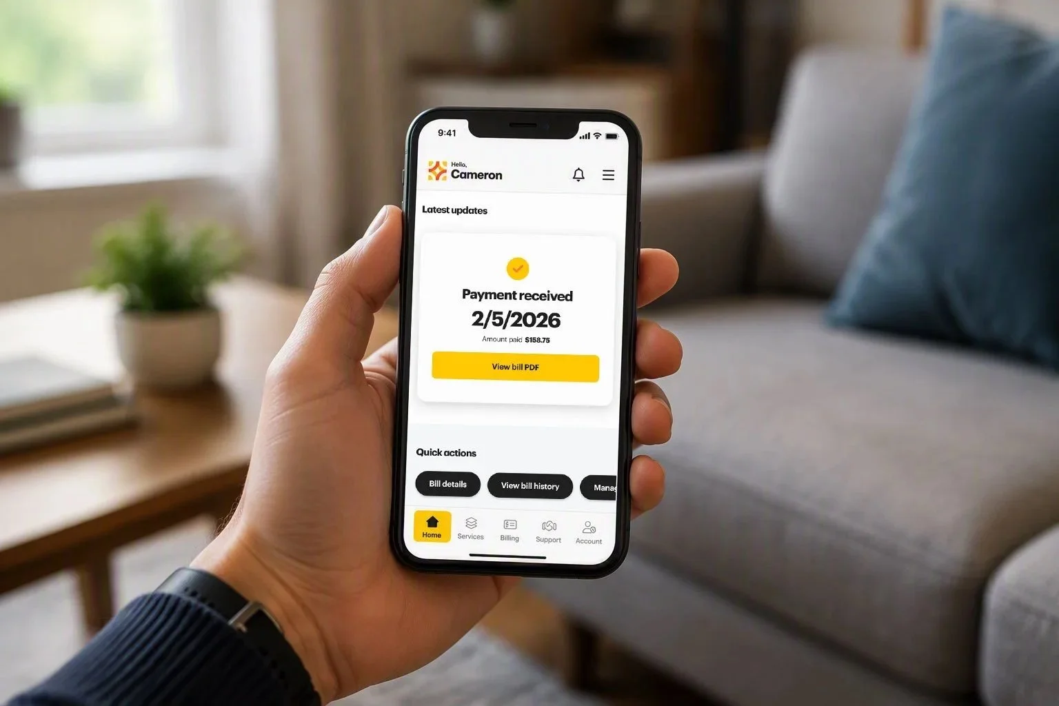
Brightspeed, a fiber internet provider, was investing in its mobile experience as a critical channel for customer self-service. Customers relied on the app to manage billing, service information, account settings, and support needs, but the experience had evolved over time and become increasingly fragmented. My role was to lead the product design effort, bringing together customer needs, business priorities, and technical constraints into a cohesive product strategy.
The Opportunity
Before jumping into solutions, I worked closely with product, engineering, research, and business stakeholders to understand where customers were struggling and where the organization saw the greatest opportunity for improvement.
Through research, analytics, and stakeholder workshops, several patterns emerged. Customers often had difficulty completing common account management tasks, navigating between related experiences, and finding the information they needed without contacting support. At the same time, the business wanted to increase self-service adoption and create a stronger foundation for future capabilities.
This work helped us align around a simple goal: create an experience that feels intuitive, trustworthy, and effortless for customers managing their services.
Our Redesign KPIs
-
Increase the number of Brightspeed app downloads
-
Reduce customer churn and solve common pain points
-
Reduce the number of support calls
Leading the Design Strategy
As Product Design Lead, my responsibility extended beyond designing screens. I helped define the experience vision, facilitate cross-functional alignment, and ensure that design decisions connected back to both user needs and business outcomes. These diagrams to the left illustrate part of that process. I went so far as to directly define the file organization and how teams can work parallel to each other. The creation of these artifacts was vital in getting the team aligned and setting expectations.
A key part of the challenge was balancing immediate customer pain points with long-term platform goals. Rather than approaching each feature independently, I focused on creating a more connected experience where common tasks shared consistent patterns, navigation, and interaction models.
This strategic approach allowed the team to think beyond individual releases and toward a scalable product experience.
Homing in on the information architecture was an important first step, as navigating the app was a major pain point for users. Through research and collaborative workshops, the above diagram was settled on. As expected, this system morphed over the course of the project. From this vantage point, however, the finer flows of the app were iterated on.
Shaping the Experience
The solution centered on simplifying core customer journeys while creating a more cohesive mobile experience overall. We redesigned critical workflows, improved navigation structures, clarified information hierarchy, and introduced patterns that made common actions easier to discover and complete.
Throughout the project, I collaborated closely with engineers and product partners to ensure solutions remained feasible while maintaining a high standard of user experience quality. Regular design reviews and stakeholder checkpoints helped keep the team aligned as the product evolved.
The result was an experience that felt more consistent, more approachable, and better equipped to support both customer and business goals.
Shown here is an example of the handoff files I provided. Attention was paid towards how users navigate each flow and what the expected outcomes were. Annotations were captured in each file.
Impact
The most rewarding part of the project was seeing design act as a catalyst for alignment across teams. By creating a clear vision and shared understanding of customer needs, we were able to make decisions more efficiently and deliver a stronger product experience.
While the interface itself improved significantly, the broader impact came from establishing a more scalable experience foundation that could support future enhancements and continued growth.
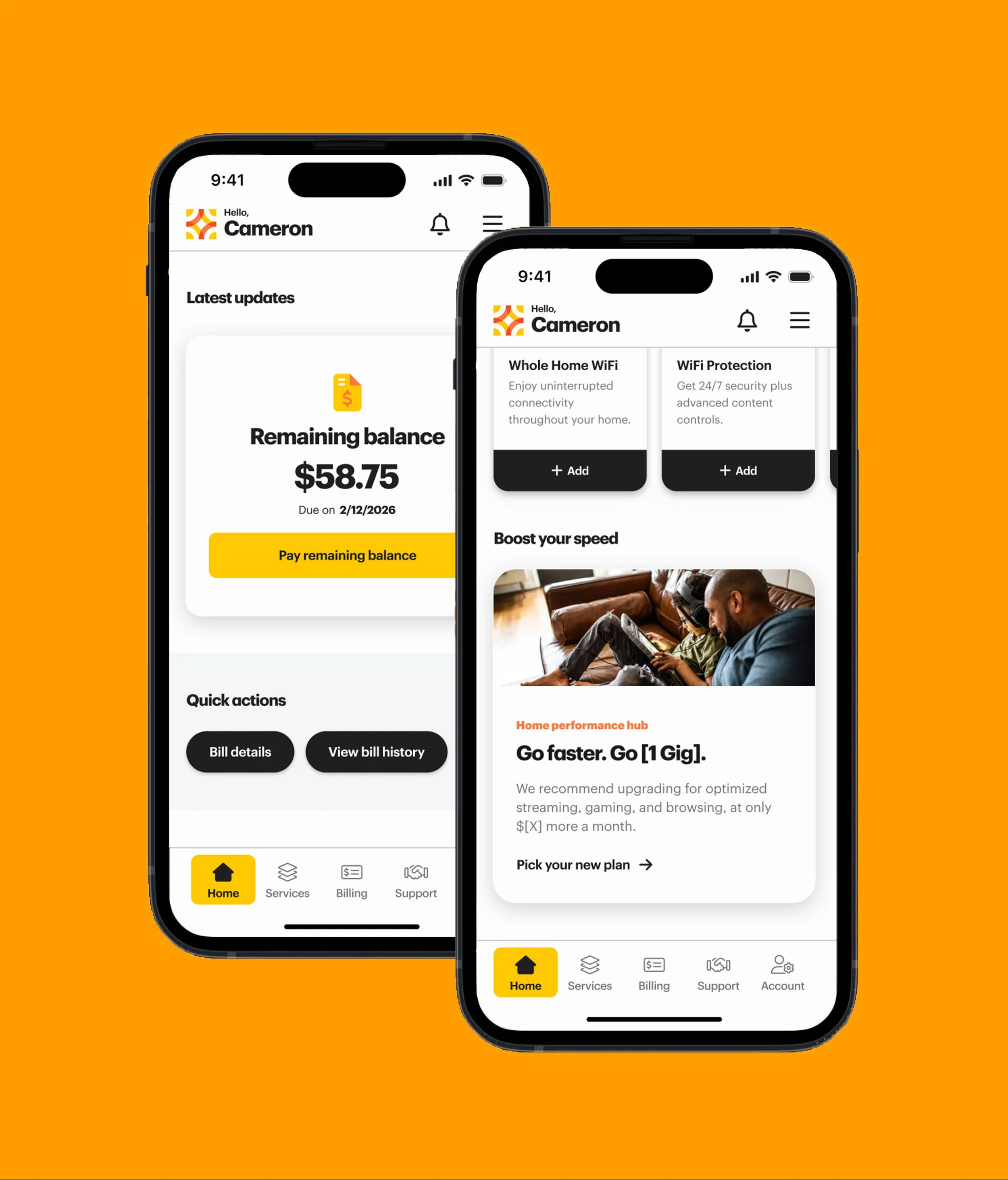
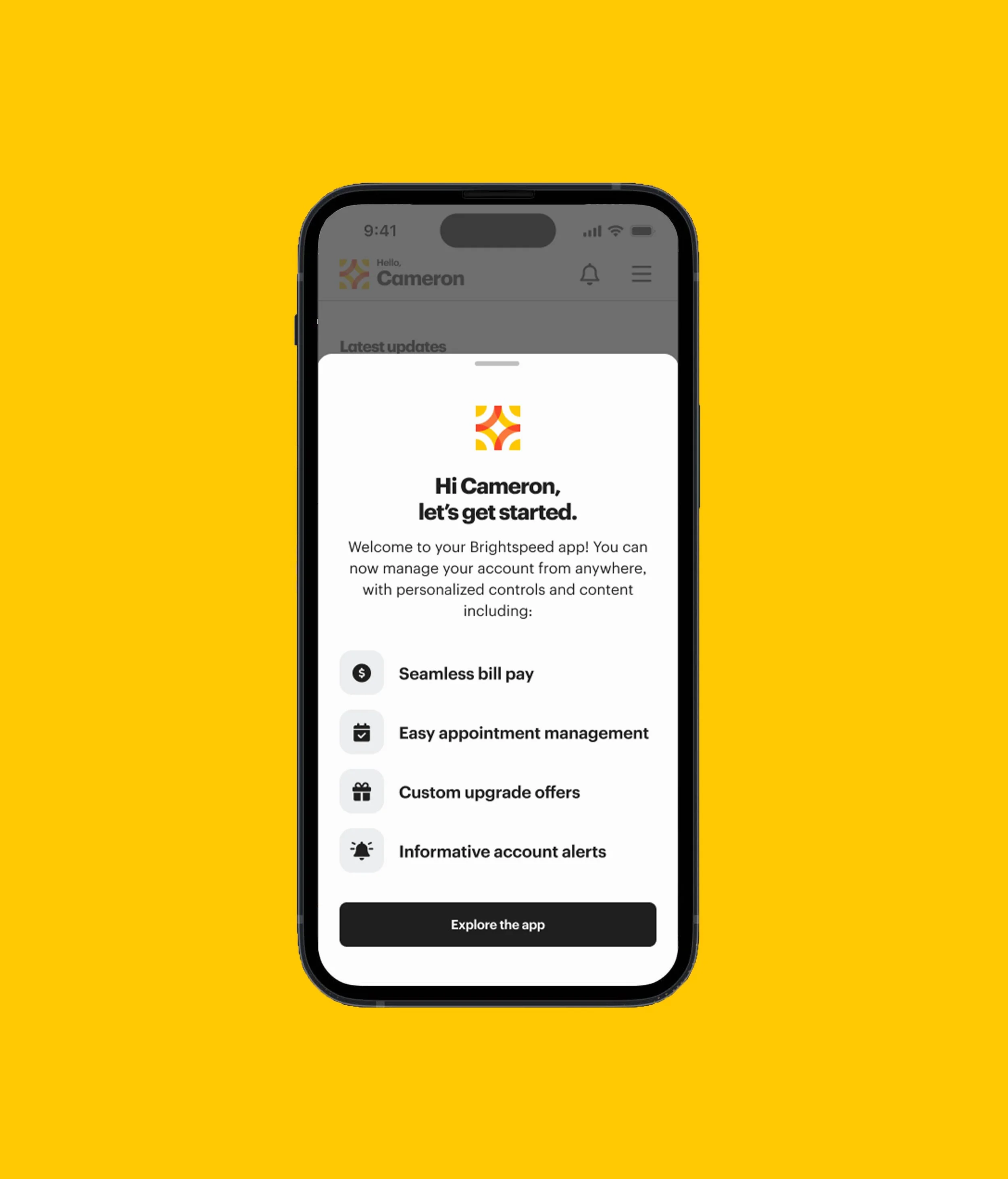
The home dashboard react dynamically to user needs.
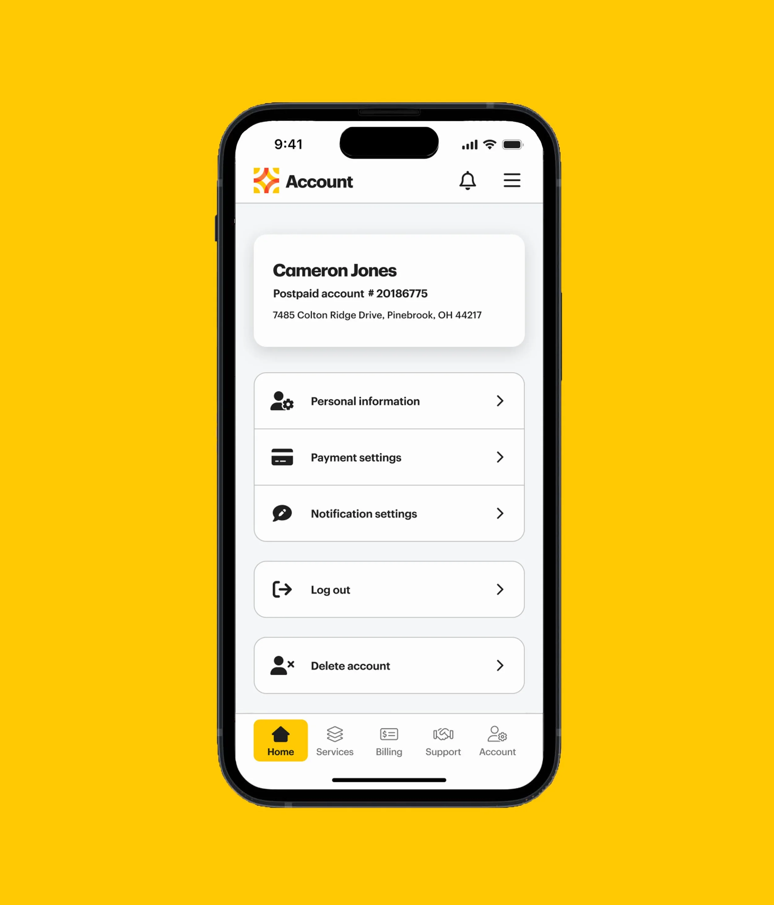
A robust and reorganized account screen providers clearer entry points to users.
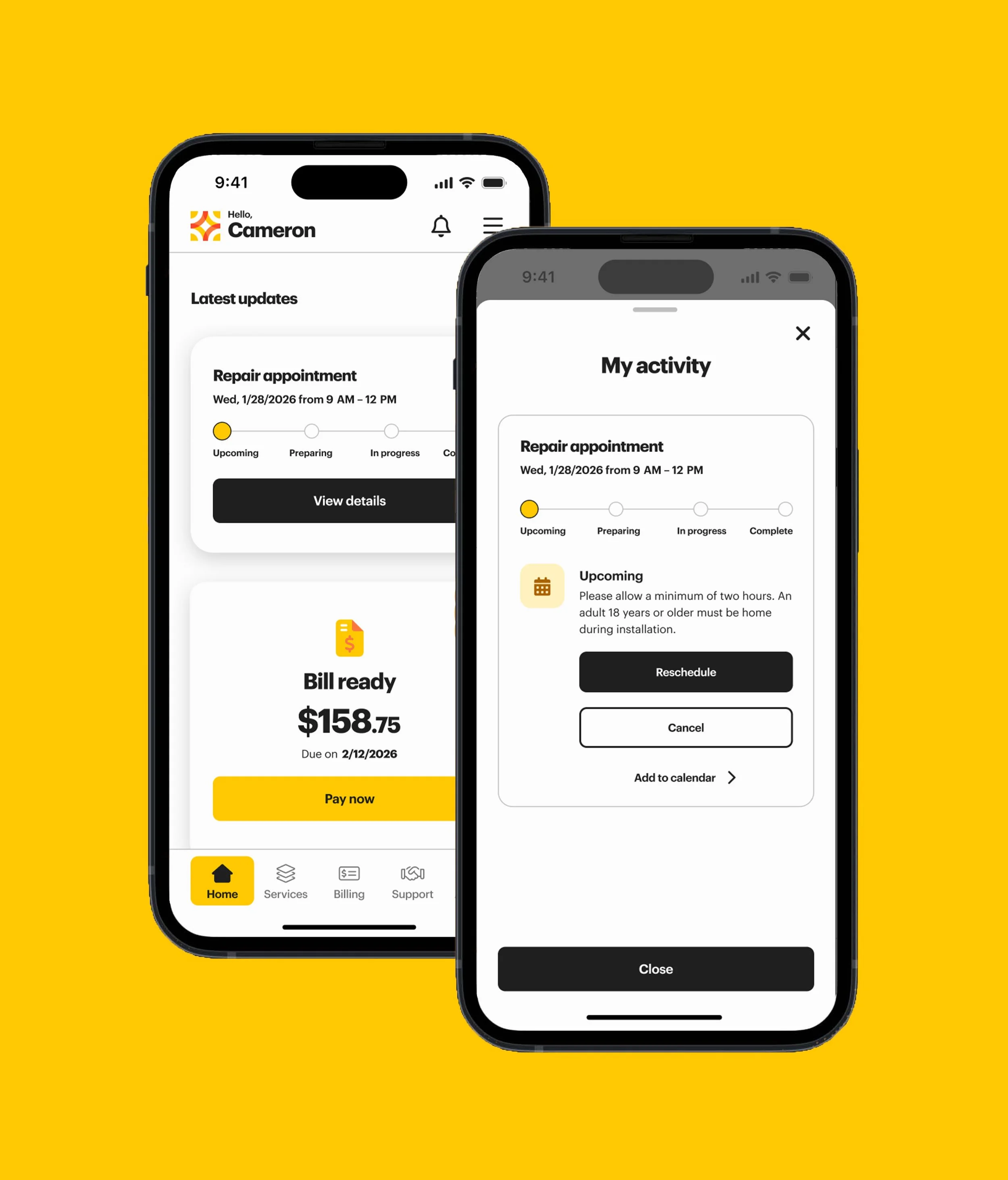
When the user has a pending appointment, a live tracker appears in the dashboard, detailing the expected steps.
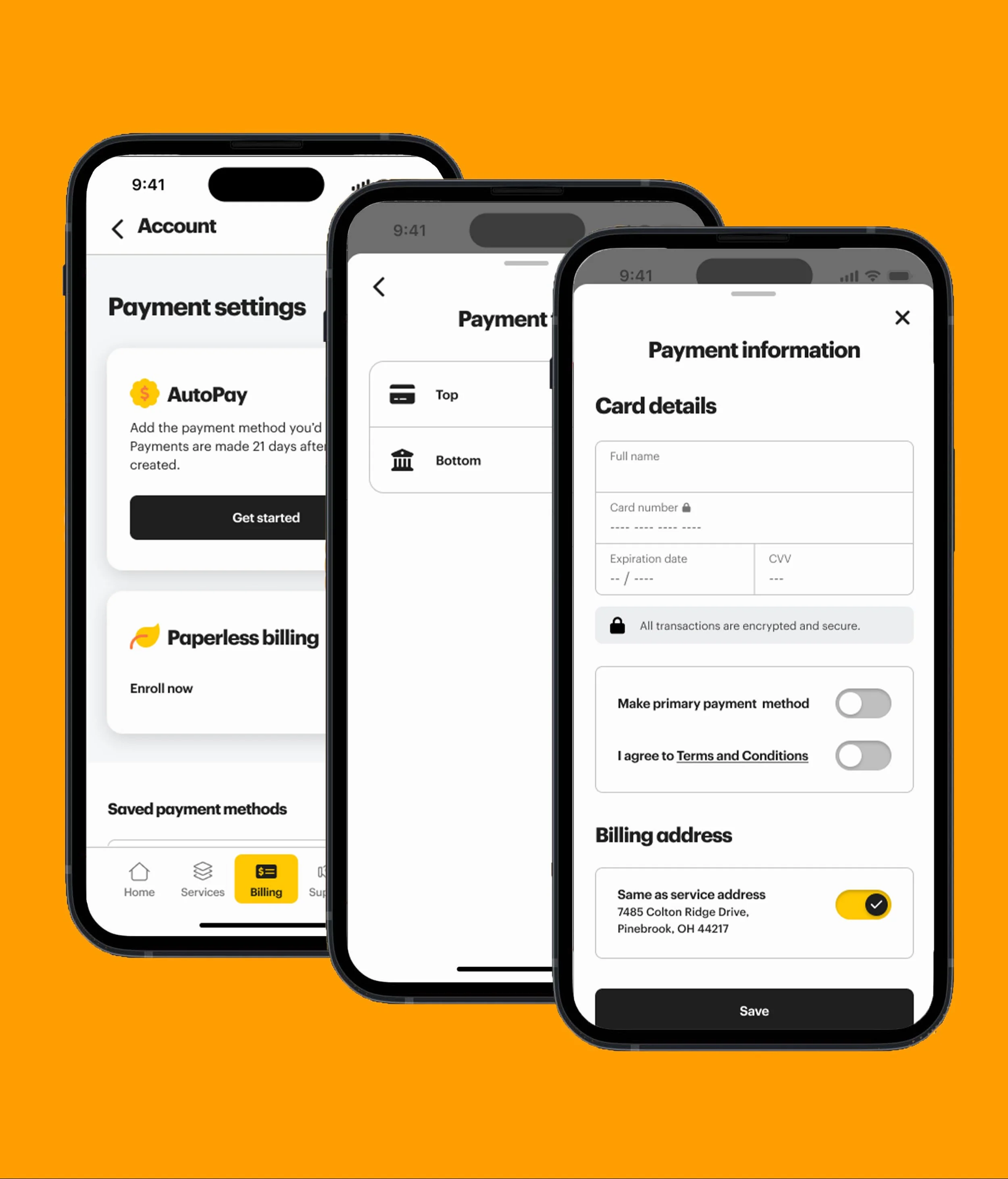
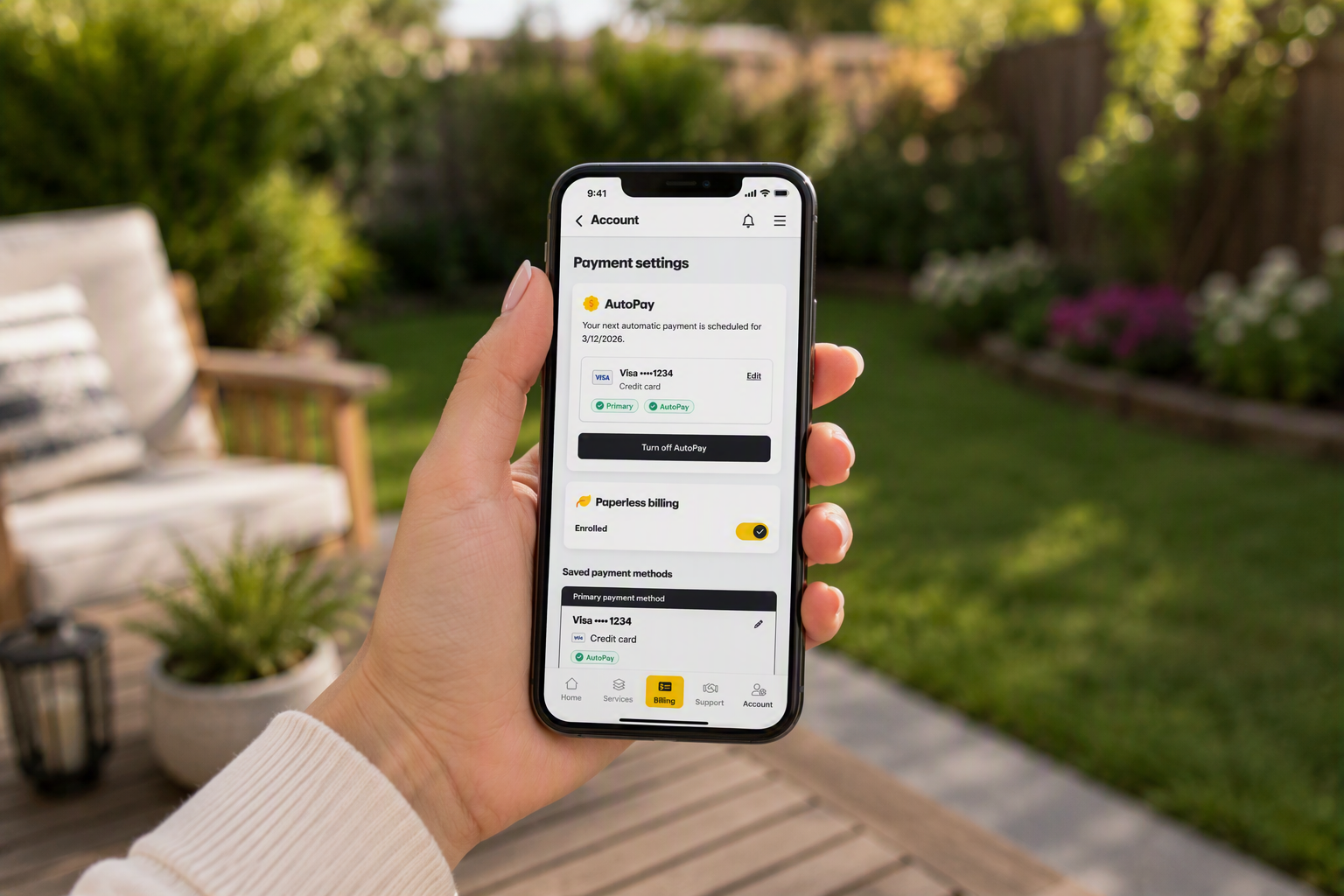
The redesigned bills page streamlines the sometimes laborious experience of adding a new payment type.
Projected Outcomes
Self-Service Adoption Increase: 15-30%
The redesign focused heavily on bills, account management, support, appointments, notifications, and service management. These are all traditionally high-volume call-center drivers and a large contributor to customer pain points.
Monthly Active User Increase: 20%-40%
Early design goals included increasing user engagement, personalization, dynamic content, notifications, and proactive service information. A simplified “pay bill now” experience also ensures repeat users.
Projected Reduction: 25-50% Fewer Steps
Information architecture improvements, hierarchy redesign, dashboard consolidation, and simplified flows helped contribute to a reduction of steps across the app experience. The Pay Bill Now flow was greatly affected by these improvements.
Projected Reduction: 10-25% in Support Calls
Help & Support requirements emphasize outage visibility, search, proactive messaging, troubleshooting, and self-service support.
Reflection
This project reinforced a lesson I return to often: successful product design is rarely about individual screens. It's about bringing people together around a shared understanding of customer problems and creating solutions that balance user needs, business goals, and technical realities.
As Product Design Lead, I was proud to help shape not only the experience itself, but also the collaboration and decision-making processes that made it possible.•